DRAWING CLASS
Blind Contour Hand Drawings
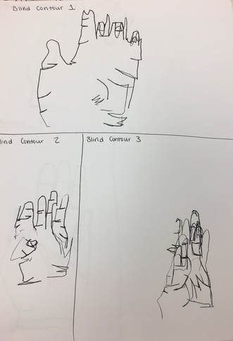
For these contour drawings, we were not allowed to look at the paper. We sat at our desk and turned around, with only our hand to look at. This was more difficult than I thought it would be because the urge to look at the paper made you second guess where your pen was and if your drawing was accurate. I also drew my hand much too small. Although this was difficult, overall I liked using this as a practice because it made the modified drawings easier.
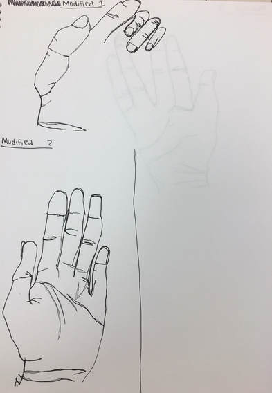
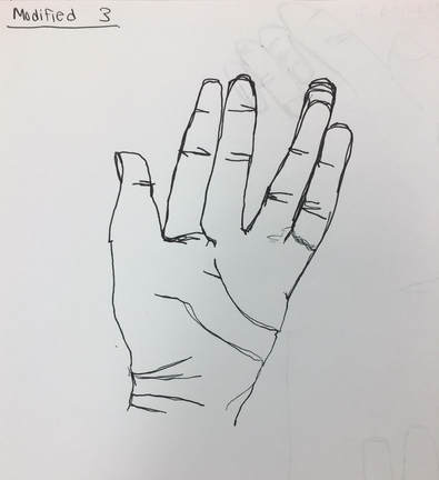
Modified Hand Drawings
|
|
After doing our blind contour hand drawings, we switched over to modified hand drawings. This time, we were allowed to look at our paper, which made the drawing process MUCH simpler. I could definitely see improvement with each hand drawing I was doing. I was able to really see all the details in my hand and put them to the drawing to bring it to life. One thing that I still need to work on is making sure that I draw my hand big enough. Although the lines were consistent, I still tended to draw them smaller than real life. I enjoyed doing the hand drawings as a warm up for larger contour drawings.
Contour Backpack
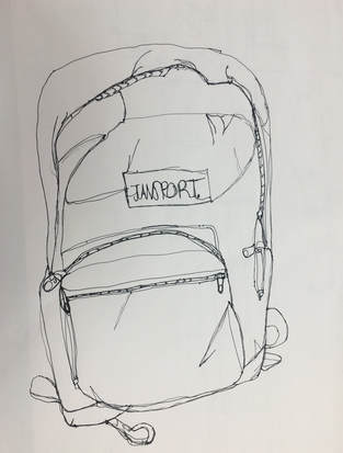
The contour backpack drawing was our first big contour drawing after practicing with our hands. This was more challenging simply because there were many more lines and textures that we had to incorporate into the drawing. I tried to make make backpack as close to it's real size as possible. It may have turned out a little smaller than the real one, however I think i am getting better preciseness with each drawing. I believe my backpack turned out decent, but I still have some things to work on and practice.
Practice Contour Room Drawing
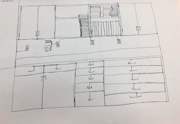
After drawing our contour backpacks, we moved on to drawing a part of the art room. This really tested how efficiently we can draw without lifting our pen off of the paper. Since the room had lots of sharp edges and details that our other drawings didn't have, this was the most challenging. I think I did well with not lifting my pen, however I wish I would have added more detail to this practice drawing.
Final Contour Room Drawing
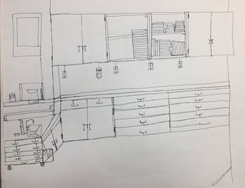
1. Yes, I did use a fluid line throughout this drawing. This is evident in many places throughout the drawing. One place you can see the fluidity is where the outlets are on the wall under the cabinets. In order to keep my pen down, I had to draw lines to the outlets. I also did the same thing with the handles on all of the drawers and cabinets. When I look closely at my drawing, I can see that all of the lines are connected, and none are free-standing.
2. After practicing with the hand initially, I really got a feel for taking your time and precisely drawing each part of the picture. I think this ultimately helped me in drawing the room because I focused harder on each individual part I was drawing. Also, the backpack drawing helped me get used to keeping my pen down the whole time.
3. With a contour drawing, you are focusing mostly on the whole picture and the textures within the objects you are drawing. An outline is simply what it sounds like and does not get nearly as much detail and volume as a contour drawing does.
4. My interpretation of lines has drastically changed after this project. It helped me understand that they are a huge part of drawings and that they can really make or break the piece. Lines helped me to capture the depth and texture of the room rather than just drawing objects for what they are.
5. From this drawing, I learned the importance of lines and the real life illusions they can create. If I could redo this drawing however, I would execute dimensions and perspective better by drawing exactly what I see. I would also draw slower and think about each individual object before I make the lines.
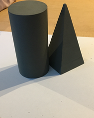
Pencil Shading Value Chart
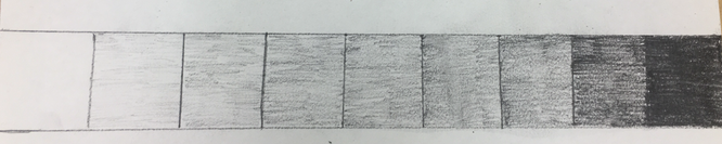
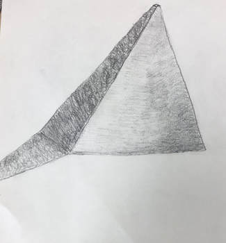
This was the first practice we had using drawing pencils. We originally started out making a value chart. This added a great way to understand the pressure you must put down in order have a lighter or darker shade. After shading in our value chart, we did another practice drawing using whatever shape we wanted. I chose a pyramid shape because i thought it would be a good example for training my hand to apply more in less pressure in certain parts; especially because of it's defined edges and corners. I think my first try at using the drawing pencils was a little difficult, but it was also a good learning experience for using a softer medium.
Shape Forms (Light and Dark Shading)

For this piece, our table was asked to draw the forms on the table and incorporate shading and shadows. Depending on where the light hit the forms, the shadows were casted. The hardest part of this piece was make sure the different shades were blended together correctly. I am content with how I exuctued this piece, and if I were to try it again I would make sure the direction of my pencil strokes are correct for whatever I am drawing.
Shading with White Mediums on Black Paper
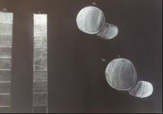
For beginning with black paper and white mediums, we made value charts just like with the regular drawing pencils. This time we used a prismacolor white pencil (on the left) and a white charcoal pencil (on the right). For me, the prisma was super easy to work with. I enjoyed the range of colors that it offers and how easily the can be blended and built up. The white charcoal had almost a chalky-like consistency. Although the charcoal seemed much more pigmented with one stroke, it was not as easy for me to blend with this medium. Overall, i think my value charts and practice spheres turned out well and were a great warm-up for our fabric drawings.
White Ribbon (Prismacolor)
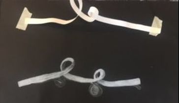
As i got used to shading in white, it was time to draw a ribbon. Ribbons are a little bit difficult to draw due to all their curves, overlaps, and shadows. One thing that made this project easy was the smooth blending with the prismacolor pencil. It allowed me to add layers if i needed it to be brighter, or less if it needed to be darker. The most difficult part with the ribbon was the shadows it casts underneath it. It was hard to draw these shadows lightly and make them look realistic.
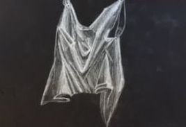
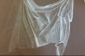
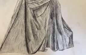
Practice Fabric Drawings and Final Fabric Drawing
|
|
|
White Charcoal Pencil PrismaColor Black charcoal pencil
Fabric Final Piece (Prisma)
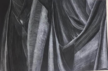
1, Yes, I did use a wide range of values in my pieces. This is evident in the pure contrast of the deep blacks and the brightest whites and how they create an illusion. I'm certain creases in my fabrics, there are a wide variety of different shades of white.
2. After creating practice pieces, i felt way more comfortable with these three mediums. I got used to the pressure I need to apply and also which mediums I enjoy using personally. This practice allowed for me to pick the best medium I could use for the best outcome on my final drawing.
3. At first, it is a little overwhelming to really capture every little detail in a drawing like this. But the way I see it, if you look at each little part of the fabric as it's own picture, it makes it easier to shade accordingly. After practicing 3 times, I knew what pressure I needed to apply for my brightest and darkest parts. The good thing with the Prisma is that I can add layers until it is the right shade.
4. You're personal interpretation of the texture is really what can make or break the piece. For some, they may think of certain fabric textures like a wave in the ocean. For me, I think of each piece as a peak and valley, just like Mrs. Rossi taught us. This really helped me to take my time and look at each individual ridge in the fabric.
5. If I were to recreate the piece, I think I would try harder to perfect the transition of my shades. In some places, it was hard for me to move from one shade into another one fluidly without making it look streaky. However, overall, I am content with my final outcome.
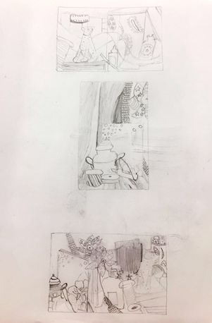
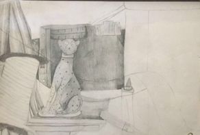
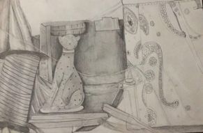
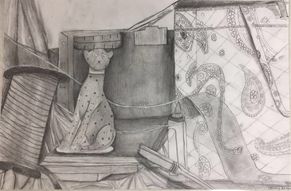
Still Life Compositions, In-Progress, and Final Piece (2b and 4b Drawing Pencil)
|
|
|
1.The craftsmanship of this piece is fairly clear. I tried my best to create precise edges and corners when it was needed, simply by using the shading and the dark tones. I also smudged some of the values together to create a better and more realistic transition.
2. Values are very important in any piece in order to show depth and dimension so that your picture doesn't look flat. I used about 6 different values in my piece to show the contrast between the super dark shadows and the bright highlights. I definitely believe that these values and transitions made my piece look more realistic.
3. I believe that from looking at my final piece you can tell that the light source is consistent throughout the picture. This light source would be coming from the top and some from the front of the picture.
4. The composition sketches were extremely important in my final piece because they allowed me to vision the still life at different angles until i found one i really liked and felt comfortable doing. I think practicing your final piece on a smaller scale and then moving it to a larger paper makes it much easier to draw the still life accurately.
5. The thing that made my final drawing most successful is the range of values that i used. I tried my best to push the shadows along the edges of objects to make them look like they were in front of others. I also tried to blend my values together as smoothly as I could to make it look more realistic than sketched.
6. For the most part, i believe my proportions are correct and realistic. At first i thought that i drew the spool of ribbon on the left side too large but then i realized that not only did it look more proportional when i added all the other objects, but it also was in the very front of the picture so it needed to be fairly big. In relation to each other, i think the objects are the correct size.
7. I think that not only the arrangement of objects on the table, but also the angle I decided to use allowed for plenty of depth and dimension in the piece. Having a wide variety of different objects with different textures allowed for practice with values and really putting them into action with a realistic picture. Overall, i was pleased with my approach and had fun learning about what i needed to do differently for each object.
8. Personally i don't think there is a center of interest in my picture. I believe that the way the objects were set up allowed for them all to fit together nicely and look great. I don't think that there is one object that stands out more than other, but i don't think that it is necessarily a bad thing in this case.
9. I feel as if i managed my time wisely for this piece. I never felt like i was in a rush with any section i was doing. I think the best thing to do is sketch out each part of the picture and then go back in with your values to blend so that you have a general outline before you make any huge choices that may not be easy to fix.
10. One challenge that i faced was that my hand kept getting dirty on the side from sitting on the pencil i had already applied to the paper. This would end up smearing on different parts of my piece which made it look sloppy ultimately. However, after this happened a few times i decided to get a wet paper towel to wipe off my hand in between each part of the picture. Also, it was sometimes difficult to make the transition of values look smooth so in those situations i used a dry paper towel to bled them together sometimes which seemed to help a lot.
11. All in all, what i have learned from drawing a still life is that there is so much more to everyday objects than what we see when we normally look at them. There are many different aspects that go into perception and shading to make any object look realistic that you don't notice until you are given the task. Although it took lots of work and time, i enjoyed doing a still life and would not mind doing it again.
Pumpkin and Grapes: Prismacolor
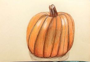
The pumpkin was the first full object we drew with the prismacolor pencils. I really enjoyed how fun it was to work with the variety of colors that I can use and add new colors that you wouldn't think to in certain pictures. For instance, in this piece I ended up using red in some places. The only thing I would do differently in this piece is start out with a lighter hand and allow a multiple layers of light shades rather than a few darker ones.
|
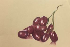
The grapes were our final piece that we made in the prismacolor pencils. I was very pleased with how my grapes turned out and how realistic they looked. I knew from practice that I needed to begin by adding the brightest highlights and make them white before I could begin blending in the other shades of purple, pink, violet, and magenta. Before this class, I never would have been able to complete something like this.
|
Glass Vase: Prismacolor
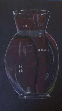
I drew this vase when we began learning about opacity. My table had this shape vase in a box with purple, yellow, and red paper taped behind it. I think that for my first glass drawing, I did a fair job. Through this project, I have learned the importance of highlights in glass or transparent drawings in general. I think that the parts where I added more highlights, look the most realistic.
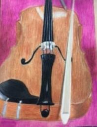
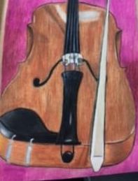
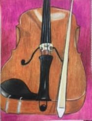
Foreshortening Project: Prismacolor
|
|
|
1. I really wanted to create a point of view that was different than what most people would normally do. Therefore, I decided to do this from the violinist's perspective. I thought this was a very realistic and creative perspective that added reality to the piece.
2. It is very important to understand perspective because so many things in the world are seen in so many different ways. If we think about looking at them in only one way then we are never really going to gain a truly realistic point of view.
3. Working with the colored pencils before my final project was very helpful. It allowed me to get comfortable with the blending of the colors and allowed me to know how much pressure to use.
4. There were many different techniques that I used to create this piece. Perhaps the most important with the prismas however, is layering. I learned that it is crucial to start out with a light hand and to build layers rather than push hard.
5. I thin k that by adding a different colored background, I was able to add depth to the piece. Although it was not a intricate or realistic background, I feel that it really brings the violin forward and makes the colors in it stand out.
6. For me, the biggest obstacle was figuring out what composition I wanted to use for this piece, At first, I had a different idea and changed it to a more personal piece with the violin. I think this choice made it easier for me to execute, but still had challenges that made me push myself.
7. Overall, I did feel prepared to do this piece by the time we started. The only thing I wish i practiced was how to blend in highlights nad shadows to make them look more realistic.
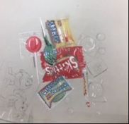
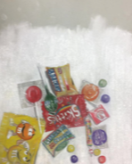
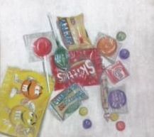
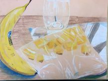
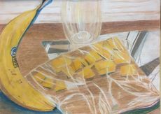
Candy Opacity : Chalk Pencils/Pastels
|
|
|
For the candy project, this was the composition that my table drew. I found that adding every highlight that I saw first was very helpful to make it look more realistic. My favorite part of this piece was the Snickers and the M&M's. I think that what made these successful was the highlights and shadows that I added. The hardest part of the project was not letting the colors over-power the highlights that I added initially. Overall, I am happy with how this piece turned out and enjoyed working on it in class.
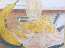
Opacity project: Chalk pencil
|
|
|
1. I believe that my piece has been fairly executed. Straight lines add up on opposite sides, shadows are accurate, as well as the highlights. Also, in relation to the medium I used, which usually tends to smudge, I believe this piece looks fairly neat.
2. I think that the light background definitely adds dimension to this piece. Since most of the tones in this piece are warm tones, I figured that a lighter background would be a nice addition. I also made it look like wood to add some texture to the piece.
3. I knew that I was going to have a lot of warm tones, such as the oranges and browns. Therefore, i knew that I needed to incorporate some cool tones as well. That is why I chose to add a bright blue shadow under the banana as well as the mangos. I also added these colored highlights to the glass and the ziploc bag. I think this really pulled the piece together and brightened it up a bit.
4. I think the biggest way that I created contrast was in the reflection of the window on the counter. This really brightened up the piece and made the bag come forward. It also contrasted well with the yellows in the banana and the reflections/highlights.
5. The biggest thing for my texture was the highlights I added to the ziploc bag. These highlights were what made the piece look much more realistic. I also loved the depth that the shadow under the banana made for the piece.
6. The wooden texture in the background was a nice alternative to a plain colored background. It also added a lot of depth due to the dark tones used in the main part of the piece. It brightened up the piece overall and made it come together nicely.
7. I think that understanding the media I used was very important in the process and overall outcome of this piece. I knew that I wanted a medium that blended easily and efficiently, rather than needing plenty of layers. Therefore, I knew that I wanted to use chalk over prismacolor pencils so that I could get the texture and blend that I wanted.
8. I had a few difficulties with this piece. One was that, because chalk does blend easily, it also smudges fairly easily. I found that this made some parts look murky instead of bold and I had to start over one time. I also had trouble making the class look glossy enough and realistic. I think that making it look see-through but still in front of the background can be very tricky. Lastly, it took me a while to execute the highlights on the bag. However, overall I am pleased and content with this piece. I can definitely see improvement in my skills after this piece.
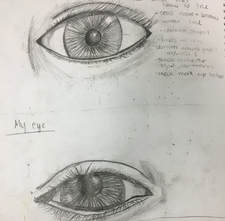
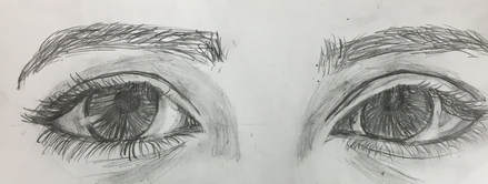
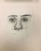
Eyes: Drawing Pencils
|
To start out drawing the face, we drew eyes. Its very important to draw the eyes first in order to make the portrait look like the person you are drawing. I found that the hardest part of the eyes was correctly drawing the shape of the eye. If you can not draw the correct shapes, angles, and proportions, then you cannot capture the unique qualities of each person's eyes.
|
|
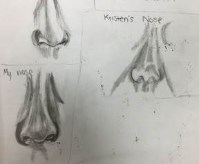
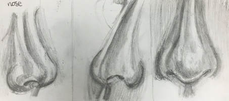
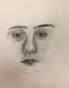
Nose: Drawing Pencils
|
|
After we drew the eyes, we moved on to the nose. The nose can also be tricky for different reasons. You have to make sure that the shape of the nostrils and the tip of the nose are correct and true to the person you are drawing. It is also hard to transition between light and dark shades, so I am working on that for my final piece.
Lips: Drawing Pencils
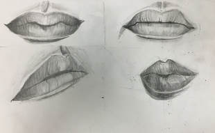
For the lips, the most important part was the direction of the shading. If you shade straight down, then you lose the fullness of the lips and then they just look flat. Its also very important to not be afraid to go dark. I feel like in the places that I went dark, it looks much more realistic and detailed. Out of the 3 (eyes, nose, and lips) the lips were the easiest for me but I still have lots to practice and fix with them.
Skull Drawing
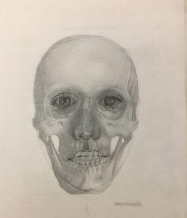
For my skull drawing, I was out sick and never had the chance to complete it. However I feel like the parts I did do allowed me to be more accurate with my final self portrait. The proportions of the main parts of the face helped me get the proportions correct on my final. Overall, this was a good tool for my self portrait and where I needed to place the eyes, mouth, and nose.
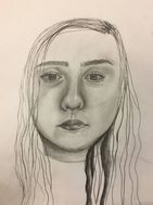
Self-Portrait
|
|
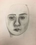
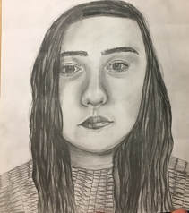
1. The process I went through was very lengthy. First, i started out sketching the basic egg-shape for the head and then the proportions for the eyes. After i sketched the basic shapes, i started customizing the eyes to match my face in my reference picture. Secondly, i sketched the nose and lips using my proportion rules as well. After that, I began shading these in the same order. The majority of my work for this was shading. I then adjusted my face structure and shaded that, and then finally added hair with a range of values.
2. It was not too difficult to find the different values in my picture. I looked closely at the different highlights and shadows and how dark or bright they were. It was easy to shade as long as you use your reference picture and range your values in it, then it can be easier than you think.
3. I think that I did a good job of ranging my values in this piece. I really tried to focus on the deep darks first and then shade out from there. Adding the midtones really added a nice realistic contrast between the darks and highlights.
4. The craftsmanship of this piece is fairly neat. It was difficult for me to keep it neat due to all the dark shades I added. Sometimes the graphite would smear onto the light parts of the piece and I think I did a good job of cleaning that up. I also think the stitching on my sweater is neatly executed.
5. I think the best way to capture my look was by looking at each individual part as a shape rather than my face. I tried to copy my picture to the paper as accurately as I could. It also helped to draw upside down so that you aren't subconsciously trying to draw the face (which can mislead you). I think the eyes took the longest because one little thing can change the overall look of the eyes and therefore the face.
6. To make sure I had correct feature placement, I used the rules that we learned in class. Before I even began shaping the features to my face, I made sure that they were the right distance apart from each other. I used the eyes to correctly place the features away from each other and this seemed to really help and look accurate.
7. It is definitely important to draw each of the features individually. If you look at them as a whole face instead of individual shapes, it can be misleading and inaccurate because you are just looking at a huge picture. Drawing each feature on it's own allows you to focus on that one part specifically and therefore make it more accurate.
8. I think the most beneficial part of this project was definitely the shading. Being able to look at a reference picture and transferring the lights and darks to a piece is very crucial and can be used in most all drawings. It was also very important to focus on individual parts of the drawing instead of just rushing and drawing the whole thing at once. Like I said before, it is better to focus on small parts at a time and this project helped me learn that.
9. One obstacle that I dealt with was the length and width of my nose. I wanted to make it look proportional but also wanted it to look the same size as my nose. I executed it by using the rules I learned for proportions and I think it turned out alright in the end. Another obstacle was the shape of the eyes, since they are really what makes a person's face unique. I focused very hard on the specifics of the shape of my eyes and the inner and outer edges of them and it seemed to work.
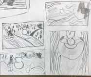
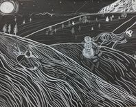
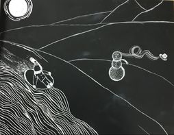
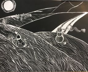
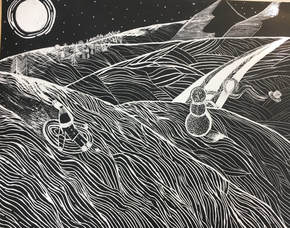
Scratchboard - 1/11/18
|
|
|
|
|
1. For this project, I was inspired by the recent snow day we had. I have always loved snow and wanted to capture the feeling of a starry winter night in the cold. This is why I chose some of my favorite things in the snow including sledding, a snowman, the mountains, and stars.
2. I feel like the lines I used for the snow really enhanced my piece and the dimension of it. In the front I kept the lines really close together so that they were almost completely white and then made them further apart as it went back. I also added texture on the snowman and on the mountains to show highlights on the snow.
3. I think that the deep dimension of my piece is what created such a good balance. If I would have made the composition closer up, it would have been all one color. The bright whites in the front in contrast with the dark sky created a perfect balance for this piece.
4. For the movement aspect of my scratchboard, I did a few different things. First, I made a kid sledding down the hill with the snow spraying out the back. Then, I made the wind blowing the hat off of the snowman. I think this added more life to this piece and also made it more fun to look at.
5. One way that I could improve my artwork is by adding more movement. Maybe I could add more people or show different places that the wind is blowing in the background. Also, I could do an even wider range of dark and white tones in this piece.
6. I think that the tightness of my lines from the front to the back really added a good contrast of tones. I also added super bright white highlights on places on the snow where the moon is shining. I also made darker shades on the places where the moon was not shining, like on the right sides of the mountains and the right sides of the hills.
Final Class Evaluation 1/11/18
This class has taught me SO much about not only art, but who I am as an artist. I have learned a lot about my strengths and weaknesses and how I can improve both. My favorite project was probably the opacity and scratchboard projects. The opacity project strengthened my drawing and shading and allowed me to really focus on what I see rather than what I think I see. For the scratchboard, it was a really fun project that helped me pay even more attention to dark and light contrasts. Overall, the biggest thing I will take from this class is learning about the importance of dark and light tones in the pieces and how to shade carefully and smoothly to create a realistic composition. This was a very fun class that taught me a lot!
- Cassidy Wright
